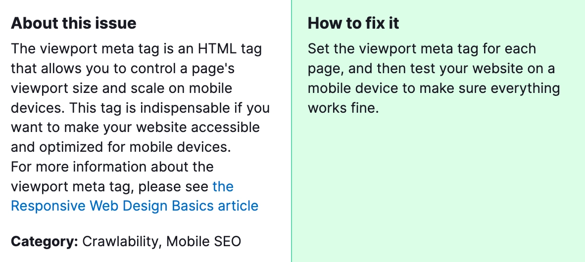
In the realm of Search Engine Optimization (SEO), ensuring your website is optimized for mobile devices is no longer optional; it’s imperative. One common issue flagged during website audits, such as those conducted by SEMrush, is the absence of a viewport meta tag on web pages. This tag informs browsers how to control the page’s dimensions and scaling to fit the screen of the device it’s being viewed on. Without it, your site may not render correctly on mobile devices, leading to a poor user experience. This not only affects user satisfaction but can also negatively impact your site’s mobile search rankings, as search engines like Google prioritize mobile-friendliness as a ranking factor.

Why is it important to fix? Fixing pages without a viewport tag is crucial because it directly influences your website’s usability and accessibility on mobile devices. A site that is not optimized for mobile viewing may suffer from misaligned content, unreadable text, and difficult navigation. These issues can increase bounce rates, reduce the time spent on the site, and ultimately lower conversion rates. Additionally, since search engines give preference to mobile-friendly websites, failing to address this issue can harm your website’s search engine rankings, making it less visible to potential visitors.
How to Fix “Pages Have no Viewport Tag” Detected by a Semrush Audit?

Steps to Fix “Pages Have No Viewport Tag”:
1) Identify Affected Pages
Start by using SEMrush or another SEO audit tool to identify which pages on your site are missing the viewport meta tag. These tools typically provide a detailed report highlighting specific pages that need attention.
2) Edit Your Website’s HTML
For each page identified in the audit, access the HTML code. You’ll typically do this through your website’s content management system (CMS) or by editing the HTML files directly if you’re hosting the site yourself.
3) Add the Viewport Meta Tag
In the <head> section of your HTML document, add the following line:
This tag tells the browser to match the page width to the screen’s width in device-independent pixels and sets the initial zoom level when the page is first loaded by the browser.
4) Test on Multiple Devices
After adding the viewport tag, test your website on various devices and screen sizes to ensure the pages render correctly. Tools like Google’s Mobile-Friendly Test can provide insights into how your site performs on mobile devices and highlight any remaining issues.
5) Monitor and Optimize
SEO and website optimization are ongoing processes. Regularly monitor your site’s performance and conduct periodic audits to identify and fix new issues as they arise. Pay special attention to mobile usability, as trends and standards evolve over time.
By addressing the “Pages Have No Viewport Tag” issue, you’re taking an essential step towards improving your website’s mobile usability and SEO. Remember, optimizing for mobile is not just about avoiding penalties or improving rankings; it’s about providing a better experience for your audience, regardless of how they access your site. If you need additional help with SEO optimization of your website, please contact our specialists.


